
The Brief
What we were asked forA brand-new engineering consultancy with a familiar problem: it needed to look like it had been running the grid for a decade. By Monday.
The Mark
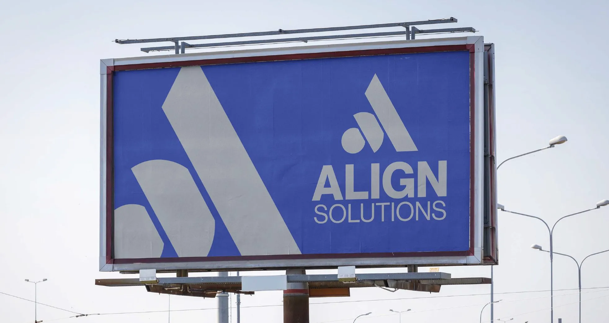
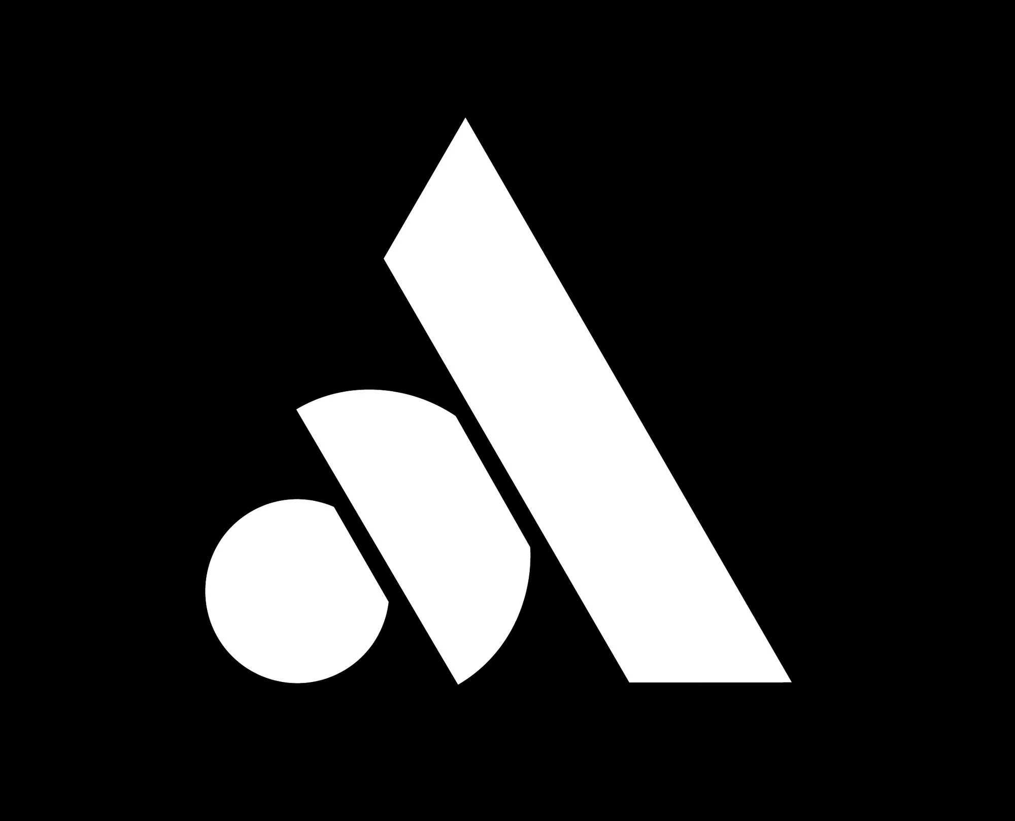
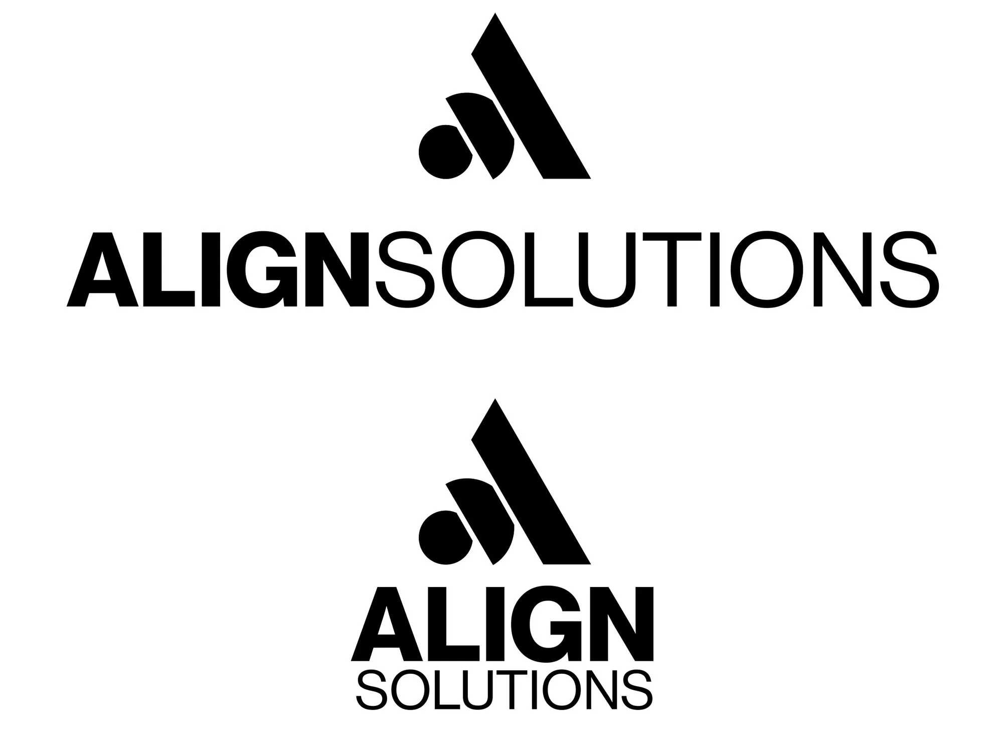
Engineered, not drawnPrecise 45° and 60° angles give the mark the stability of energy infrastructure; the stencil-cut nodes stand for complex systems brought into alignment. No gears, no turbines: an abstract, geometric icon that reads at any scale.
The System
Neue Haas GrotesqueThe heavy “ALIGN” against the airy “SOLUTIONS” sets a schematic-like hierarchy: locked up horizontally for site headers and vehicle liveries, stacked for avatars, decals and embroidery.
The Palette
Tap a column to copyCobalt leads with authority; industrial greys do the quiet work. Colour was only finalised once the black-and-white geometry was approved. Colour never props up a weak mark.
In The Wild
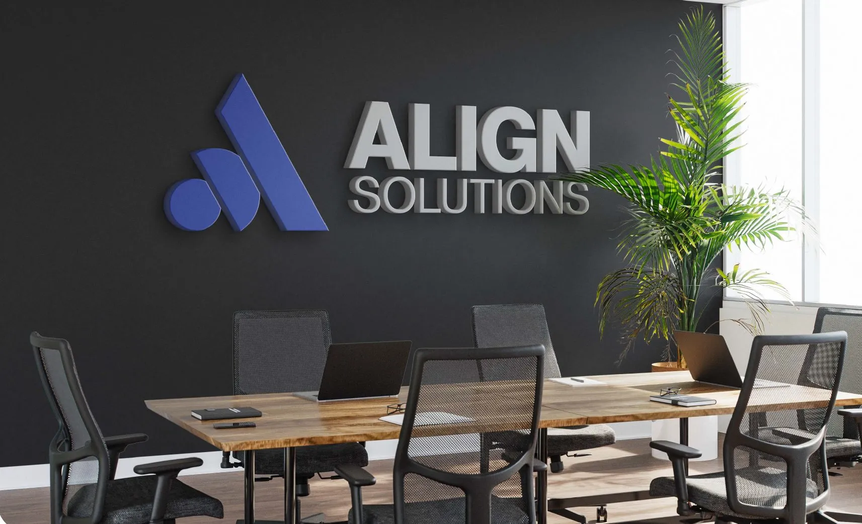
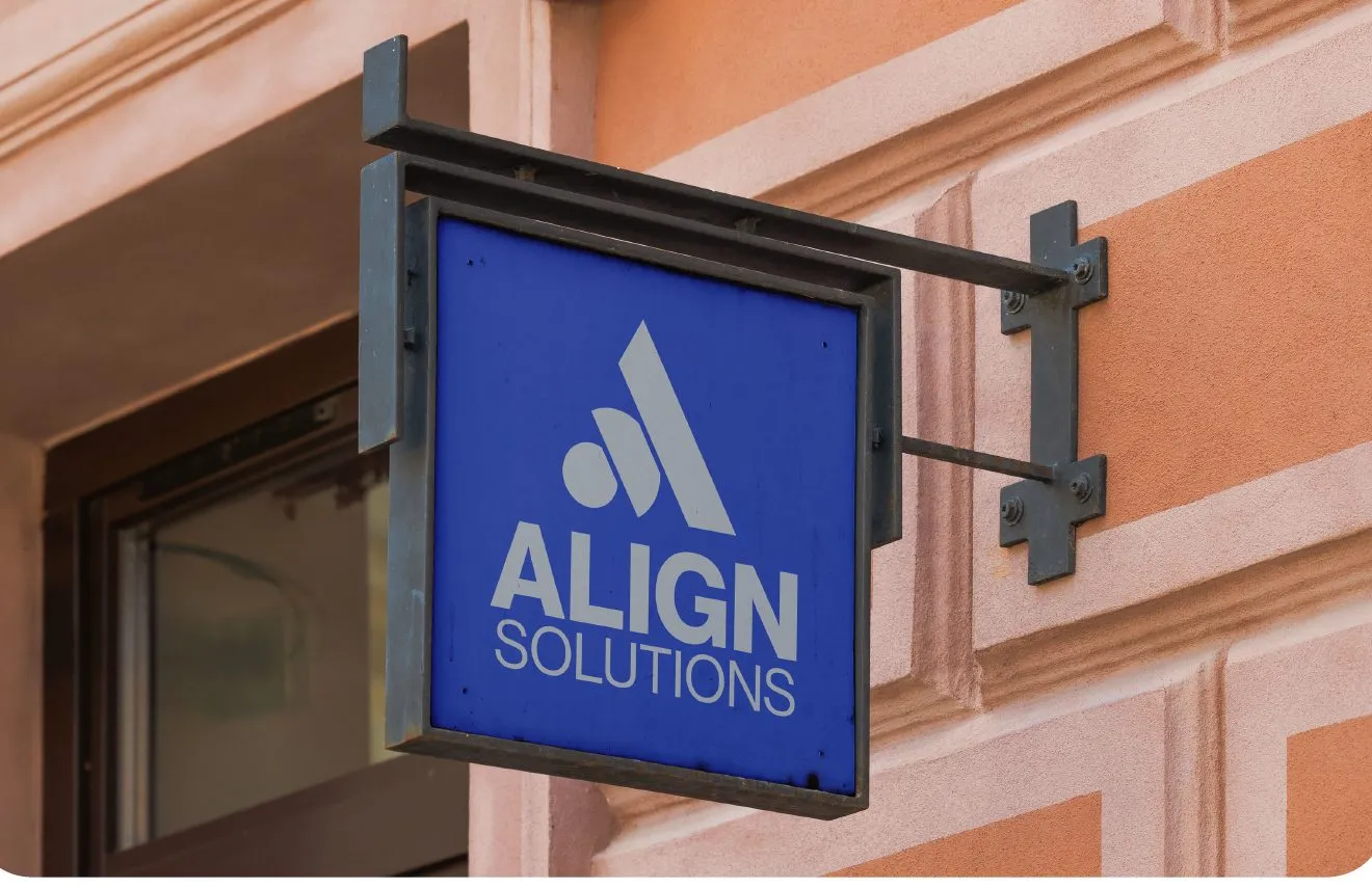
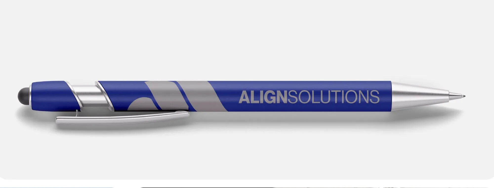
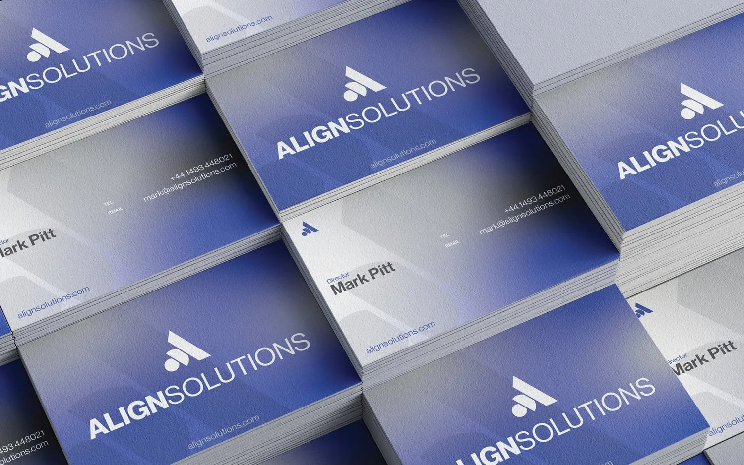
One system, every touchpointStreet signage, billboards, boardroom walls, business cards and the pens that sign the contracts. The identity holds its nerve at every size.
On Screen
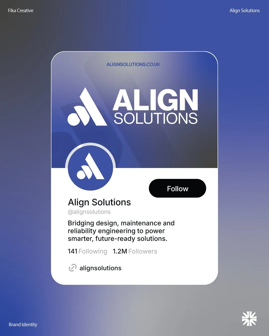
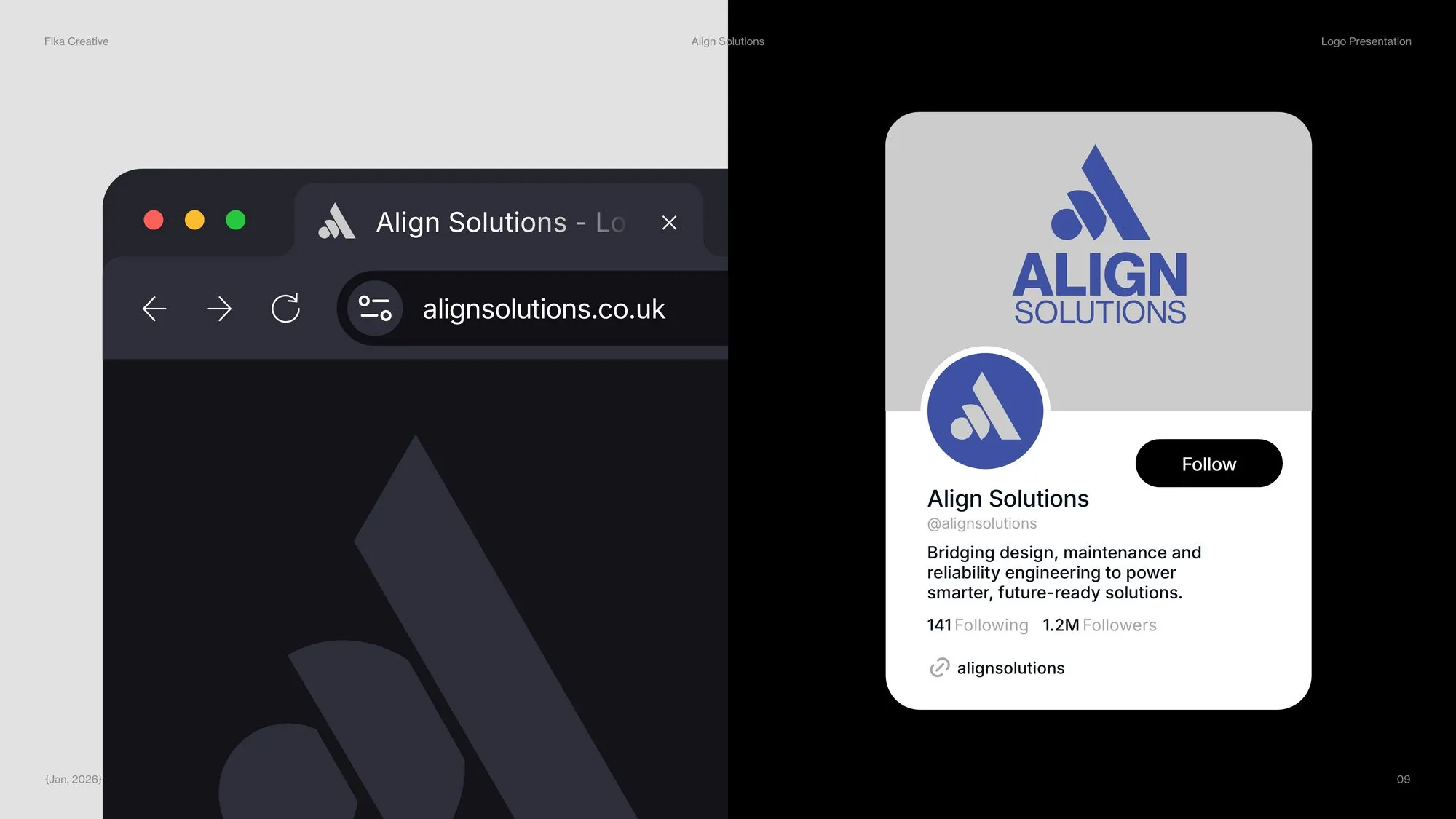
alignsolutions.co.ukThe identity carried straight onto the web presence and the social profiles it launched with.
The Website
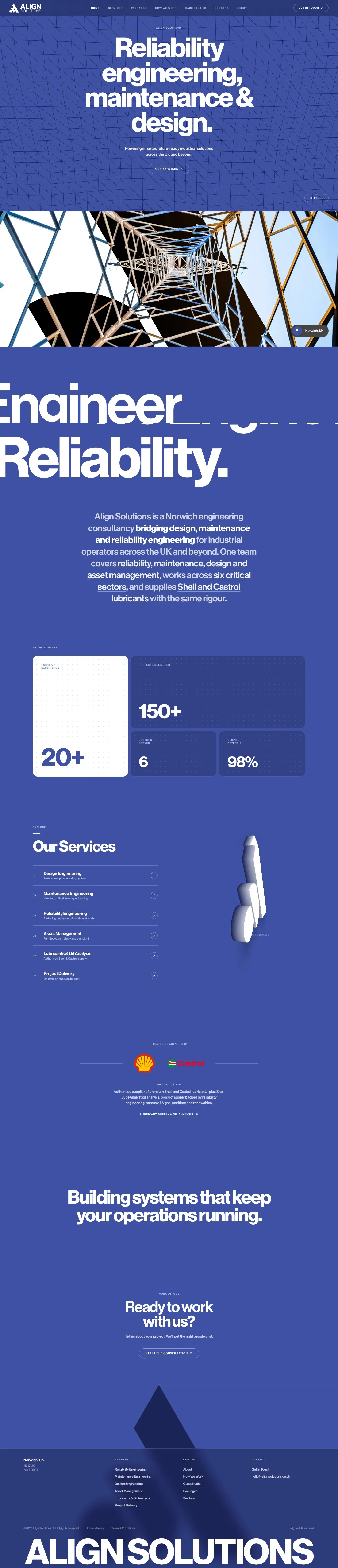
The full homepageThe cobalt and the 45° geometry carried onto the live site, from the first screen to the footer.
On A Phone
Mobile first screen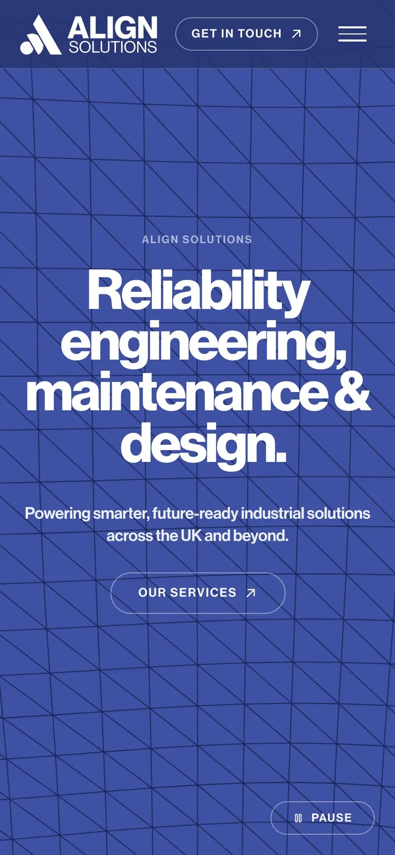
Start a project like this.
Tell us what you’re after. We’ll read it over coffee and reply within 48 hours.
- (Call)07799 522150
- (WhatsApp)Message Jack
- (Email)jack@fikadesigns.co.uk
- (15 minutes)Book a call
Tack!
Your note is on its way to Jack. Expect a reply within 48 hours, usually faster, often mid‑coffee. Stick the kettle on.